
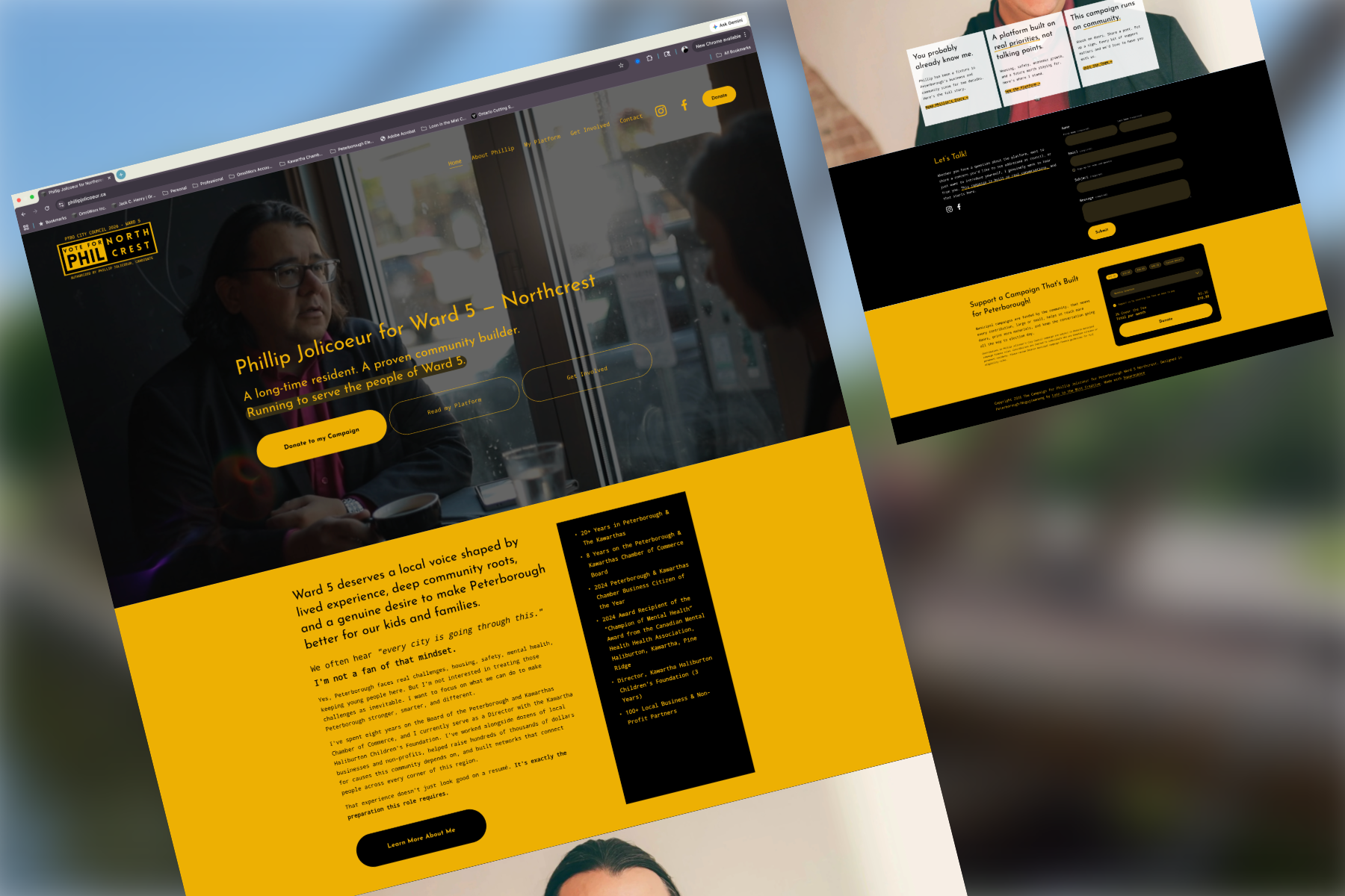
Campaign Website
The Campaign to Elect Phillip Jolicoeur for Ward 5 | Website Design
Full website design for a Peterborough municipal election campaign.
Phillip Jolicoeur ran for Peterborough City Council in Ward 5, a community-rooted campaign centred on accessible, accountable local government.
He partnered with us to build a campaign website that could introduce him to voters, communicate his platform clearly, and serve as a central digital hub throughout the election season.
Problem & Strategic Objectives
Client Needs
Phillip needed a professional web presence that could establish credibility quickly in a compressed campaign timeline, competing in a ward with established incumbents and high voter familiarity expectations.
The site needed to speak to a broad Ward 5 audience, long-time residents, young families, renters, and homeowners, without feeling generic or impersonal.
The campaign had no large budget or marketing team, so the site needed to work hard and independently, communicating platform, building trust, and driving volunteer and voter engagement without ongoing support.
The design needed to feel local and personal, not like a templated political campaign, reflecting Phillip's authentic connection to the ward.
Strategic Goals
Establish Phillip's credibility and presence as a candidate: grounded, approachable, and genuinely invested in Ward 5.
Present platform and priorities in a clean, readable layout that voters could navigate easily.
Create a clear call-to-action pathway for visitors, whether they wanted to learn more, volunteer, or connect with the campaign.
Deliver a site that could be managed independently by the campaign team after launch, without requiring ongoing design support.
Our Approach
Platform & Architecture
Chose Squarespace (version 7.1) for its ease of editing, reliable hosting, and suitability for non-profit maintenance.
Opted for a single-page (or minimal page) site design so all essential information is present without much navigation overhead.
Information Prioritization & Layout
Identified the core user flows:
Someone new finds the club → wants to know what it is / how to get started
A local or visitor wants trail map / current conditions
Interest in rentals, passes, membership
Need to contact the board or get involved
Organized content so those flows are immediately available, often via prominent menu items or in-page anchors. For example: “Trail Map”, “Passes & Rentals”, “Membership”, “Trail Conditions” via Instagram link.
Visuals & Engagement
Incorporated photography of people skiing, snowshoeing, trails — to both inspire and orient visitors.
Designed the site with imagery sections (hero background, trail imagery) to carry the feeling of the trails.
Enabled quick access to maps (trail map), rentals, pass purchase info — making sure that even someone already on the trails can find what they need.
Accessibility & Usability
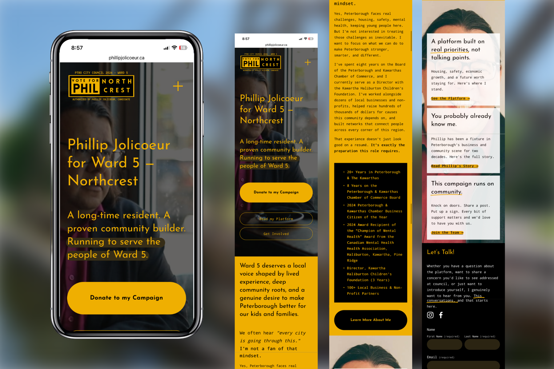
Ensured the design is accessible: readable text, clear navigation, mobile-friendly layouts.
“First time visitor / school group / already on the trails” use-cases were part of content planning. Useful info is reachable in minimal clicks.
Integrated a contact form so visitors or prospective members can contact the board easily.
Visual Direction & Layout
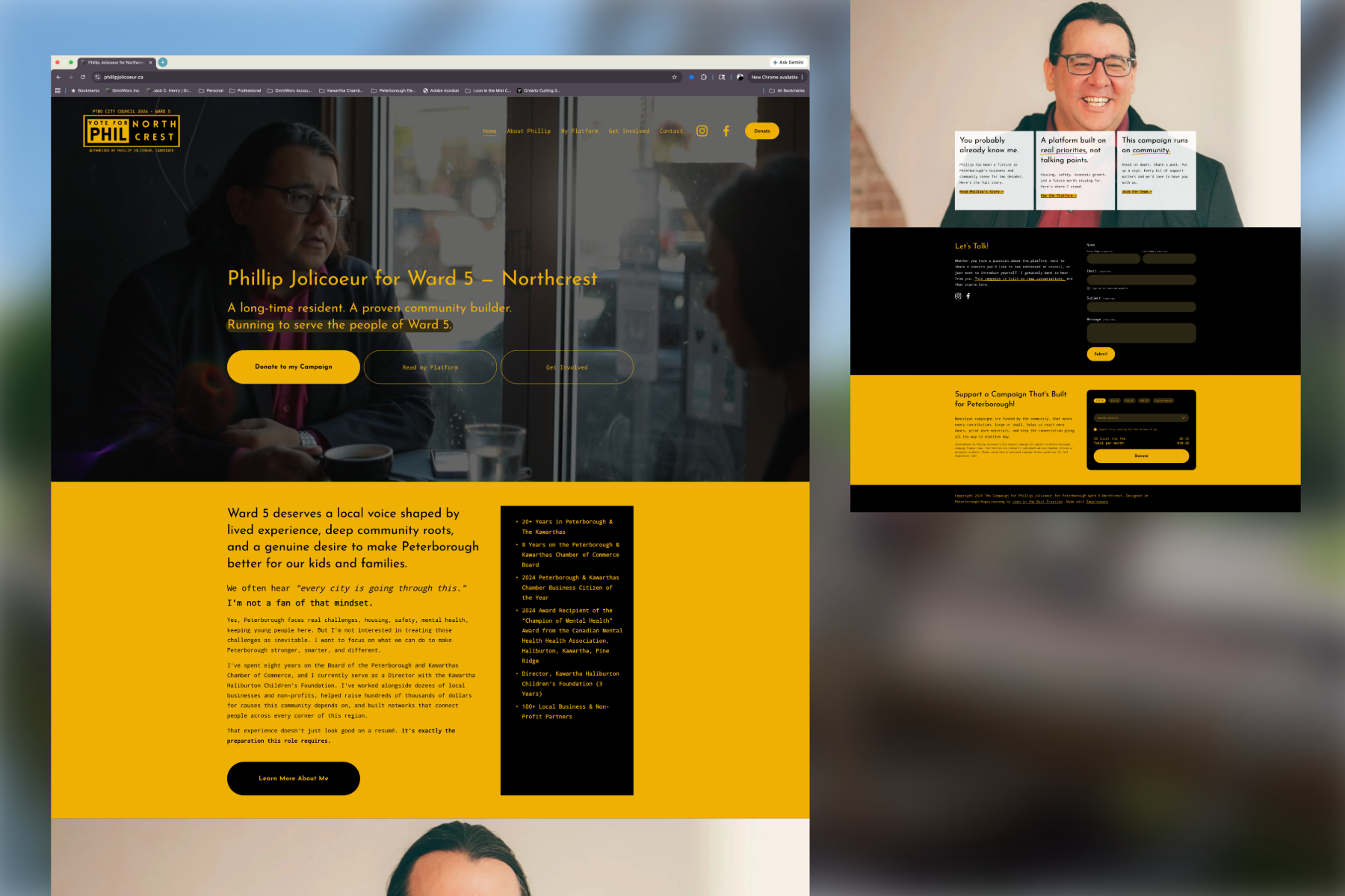
The design prioritized clarity and accessibility, a clean structure that let Phillip's platform and personality lead, without visual clutter getting in the way. The aesthetic was intentionally warm and community-focused rather than corporate or generic.
Page Architecture
We structured the site across five pages, each with a clear purpose and a logical visitor journey, from introduction, to platform, to engagement. Navigation was kept simple so voters could find what they needed quickly, whether they were learning about Phillip for the first time or looking for ways to get involved.
Platform & Delivery
The site was built on Squarespace, giving the campaign team full ability to update content, post news, and manage the site independently throughout the election cycle.
Outcomes & Impact
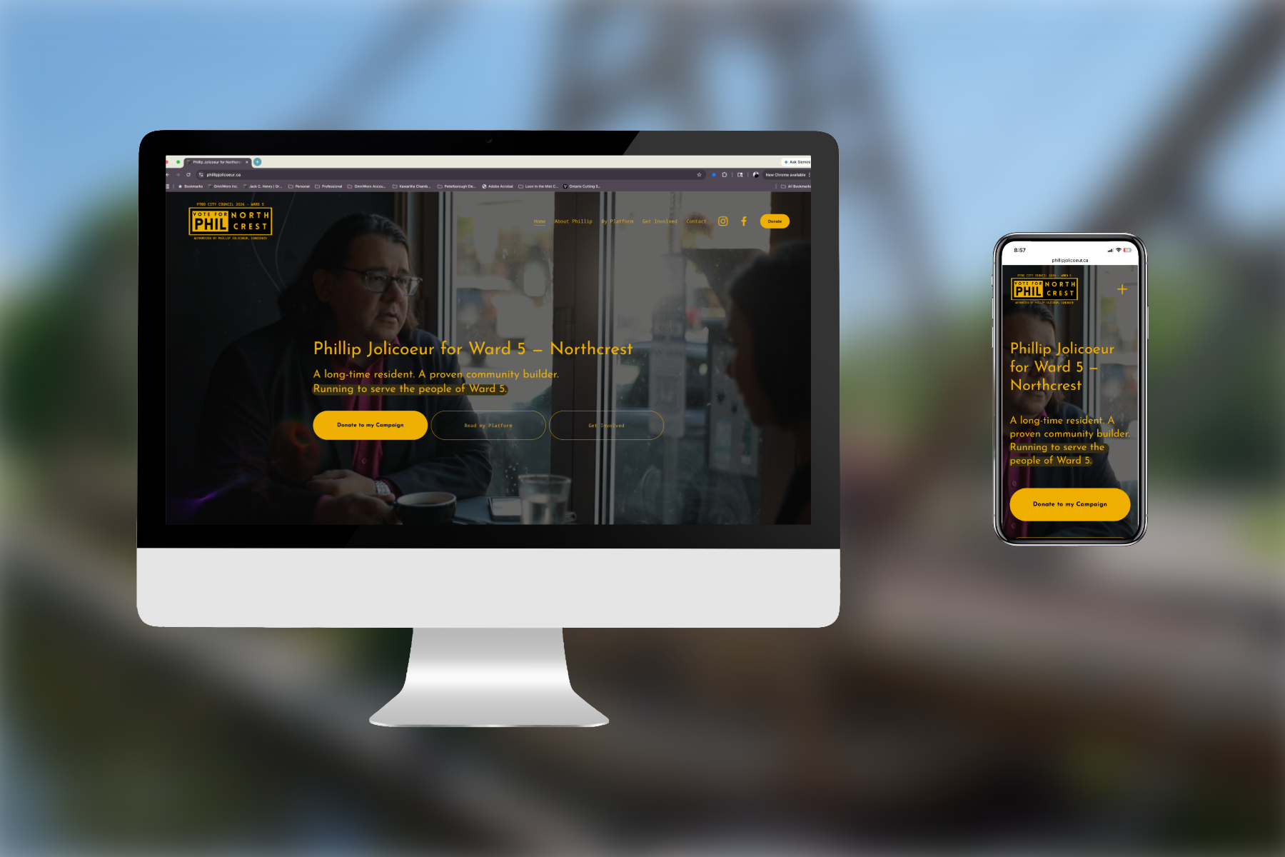
The finished site gave Phillip a credible, professional digital home base for the campaign. One that matched the seriousness of his candidacy without feeling distant or over-produced.
A clean, structured layout ensured platform content was easy to find and read, reducing friction for voters seeking to learn more.
The design's warm, community-rooted aesthetic supported Phillip's broader effort to connect with Ward 5 residents on a human level.
The Squarespace build gave the campaign full independence to manage and update the site without requiring ongoing design support.