
Website Clean Up & Strategy
The Tankhouse on Trent | Website Design & Website Strategy
Visitor-first copywriting and photography for a new waterfront pub on the Trent-Severn Waterway.
The Tankhouse on Trent opened in May 2026 as a locally owned neighbourhood pub on Buckhorn Lake, 25 minutes north of Peterborough in the heart of the Kawartha Lakes. As a new business entering a competitive tourism region, they needed more than a warm brand voice, they needed copy that would reach the right visitors, earn their trust, and bring them back.
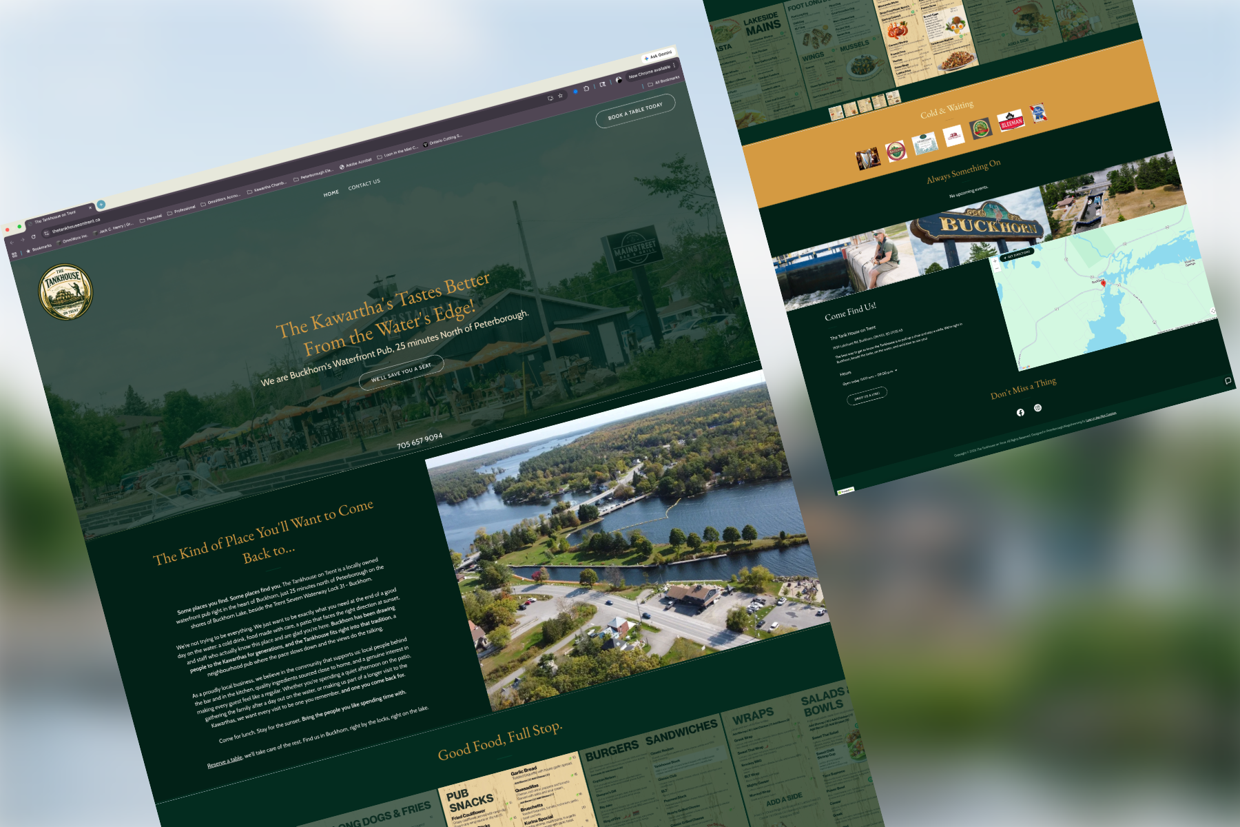
Loon in the Mist Creative was engaged to develop the full copy suite for their launch website, including hero copy, about section, page headers, CTAs, SEO titles and descriptions, and specialized pages for catering, grab and go, and gift cards. We also provided the majority of photography featured across the site.
Problem & Strategic Objectives
Client Needs
The Kawarthas is a well-established tourism destination with a crowded hospitality landscape, generic warmth and "great atmosphere" language blends into the background immediately.
As a brand new business, the Tankhouse had no established audience or reputation to lean on. Every word on the site needed to work hard to establish trust and invite a first visit.
The site needed to appeal to visitors already coming to the Kawarthas while also being discoverable by those still in the planning stage, including through AI-assisted travel tools increasingly used before visitors arrive.
Photography needed to capture the waterfront setting, the pub atmosphere, and the Buckhorn community feel authentically, without relying on stock imagery that would undermine the locally rooted brand voice.
Strategic Goals
Identify the visitor types most aligned with the Tankhouse's offer and write directly to them rather than attempting to speak to everyone.
Develop a consistent, place-rooted voice across every page and section of the site, from the hero headline to the contact section header.
Weave geographic signals like; Buckhorn, Buckhorn Lake, Lock 31, the Trent-Severn Waterway, 25 minutes north of Peterborough, the Kawarthas; naturally into the copy to support both traditional SEO and AI search discoverability.
Provide photography that matched the warmth and specificity of the copy and gave the site a genuine sense of place.
Our Approach
Platform & Architecture
Chose Squarespace (version 7.1) for its ease of editing, reliable hosting, and suitability for non-profit maintenance.
Opted for a single-page (or minimal page) site design so all essential information is present without much navigation overhead.
Information Prioritization & Layout
Identified the core user flows:
Someone new finds the club → wants to know what it is / how to get started
A local or visitor wants trail map / current conditions
Interest in rentals, passes, membership
Need to contact the board or get involved
Organized content so those flows are immediately available, often via prominent menu items or in-page anchors. For example: “Trail Map”, “Passes & Rentals”, “Membership”, “Trail Conditions” via Instagram link.
Visuals & Engagement
Incorporated photography of people skiing, snowshoeing, trails — to both inspire and orient visitors.
Designed the site with imagery sections (hero background, trail imagery) to carry the feeling of the trails.
Enabled quick access to maps (trail map), rentals, pass purchase info — making sure that even someone already on the trails can find what they need.
Accessibility & Usability
Ensured the design is accessible: readable text, clear navigation, mobile-friendly layouts.
“First time visitor / school group / already on the trails” use-cases were part of content planning. Useful info is reachable in minimal clicks.
Integrated a contact form so visitors or prospective members can contact the board easily.
Visitor Profiling & Copy Strategy
Rather than beginning with what the client wanted to say, we began with who was already coming to the Kawarthas and why. Drawing on Peterborough County Tourism's traveller segmentation framework, built on national research from the Tourism Data Collective, we assessed the Tankhouse's offer against four regional visitor archetypes.
The Bear emerged as the clear primary market: older, loyal, drawn to unhurried lakeside hospitality and the kind of place worth returning to. The Otter, purposeful family travellers seeking local connection and meaning, became the secondary market. The Fox and the Bee were weaker fits and were set aside.
Every copy decision that followed was tested against this hierarchy. The Bear's tone; warm, unhurried, quietly confident; carries the entire site. The Otter's hooks; local sourcing, community roots, the waterway as context; are layered in at natural points without ever breaking that tone.
Photography
Loon in the Mist Creative provided the majority of photography featured across the Tankhouse website. The brief matched the copy strategy: warm, place-specific, and genuinely Buckhorn. Shots prioritized the waterfront setting, the pub atmosphere, and the community character of the village. This gave the site imagery that reinforced the copy's promise rather than contradicting it with polished stock photography.
Voice & Page Copy
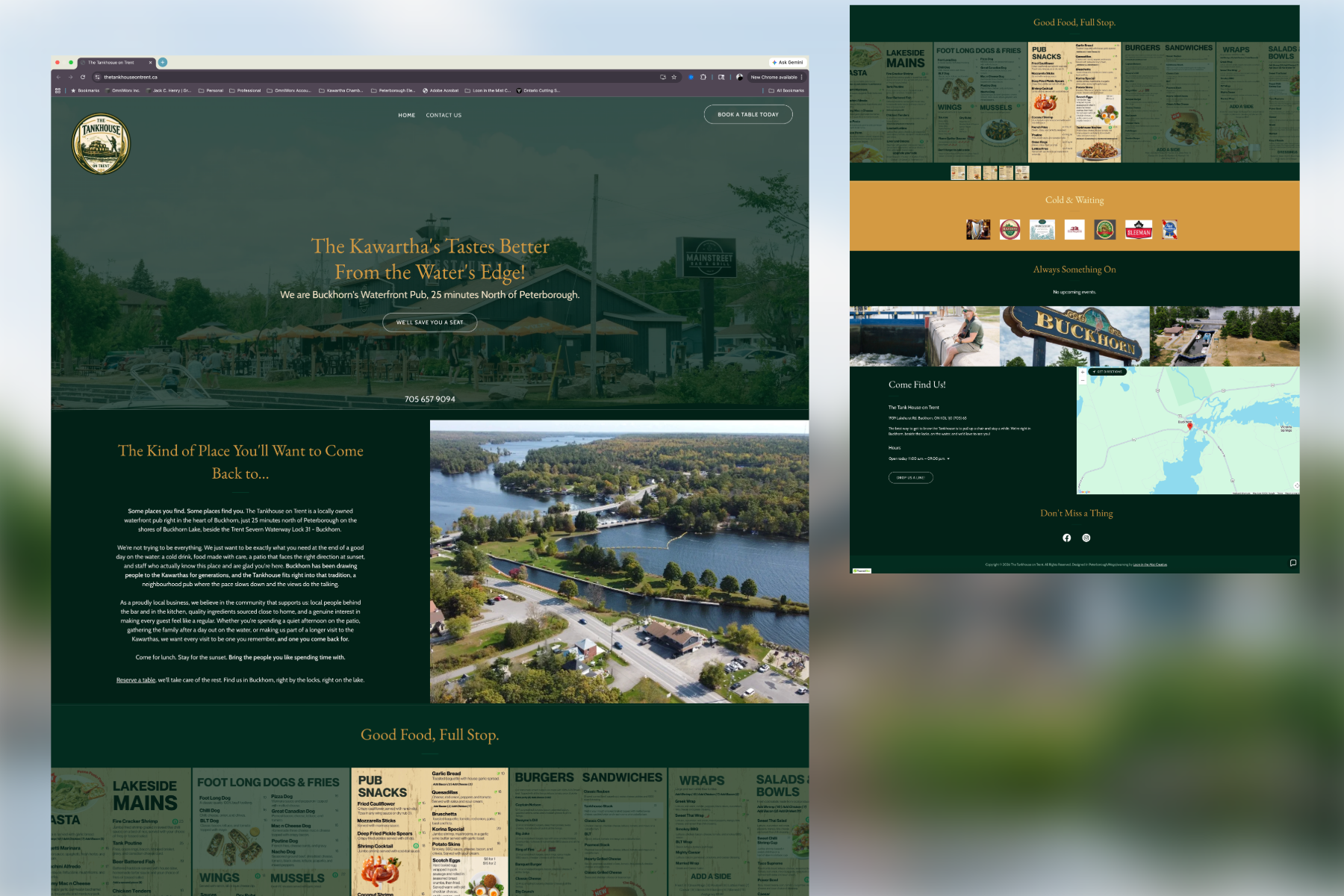
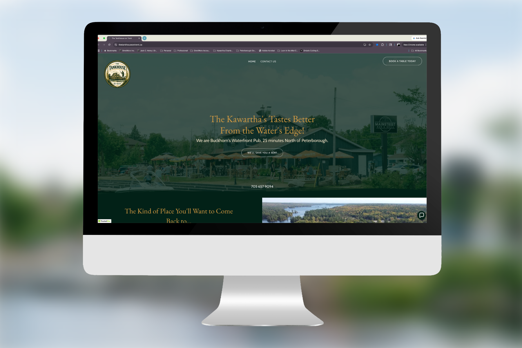
With the visitor profiles established, we developed a consistent voice from the hero image to the footer. The hero headline, The Kawarthas Tastes Better From the Water's Edge, puts the visitor in the experience before they arrive. The subhead grounds it immediately with geographic specificity useful for both human readers and search engines.
The about section, section headers, CTAs, and contact copy all follow the same logic: Bear warmth first, Otter detail where it earns its place, and location language woven in as context rather than keywords. Section headers like Good Food, Full Stop., Always Something On, and Come Find Us reinforce the brand voice at every touchpoint rather than defaulting to utility.
SEO & AI Discoverability
Geographic specificity was treated as a copy discipline, not an afterthought. Every key location signal; the village, the lake, the waterway, the lock number, the distance from Peterborough, the regional brand; appears in natural language because it serves the human reader first. This approach supports traditional search ranking while also building the coherent, specific portrait of place that AI travel planning tools need to surface and recommend a business confidently.
SEO titles and meta descriptions were developed for every page on the site, each balancing discoverability with the established brand voice.
Outcomes & Impact
A new business launched with a fully realized voice, a consistent copy system across every page, and a site built to be found by the right visitors from day one.
The visitor-first strategy means the Tankhouse isn't trying to speak to everyone, it's speaking clearly and confidently to the travellers most likely to come, stay, and return.
The geographic specificity embedded throughout the copy positions the site well for both traditional SEO and the growing role of AI in travel planning, where a clear, coherent portrait of place is the primary currency.
The photography gives the copy a visual counterpart that is as specific and genuine as the words, a site that looks and reads like a real place, because it is one.